Insurance Claim Tracker
- Timeline
- 2 months
- Role
- Product Designer
- Team
- CX team
Life Ops team
EB team
Product & engineering - Tools
- Figma
TL;DR
FWD's app let people submit an insurance claim, then left them in the dark. No visibility into claim status meant anxious customers, repeated support calls, and incomplete submissions that slowed everyone down. I redesigned the end-to-end claim tracker: clear milestones, proactive updates, and guidance that prevents errors before they happen.
- ↓20%
- Claim-status inquiries to CX
- ↓8%
- Incomplete (NIGO) submissions
- 4.5/5
- Post-claim CSAT
Solution
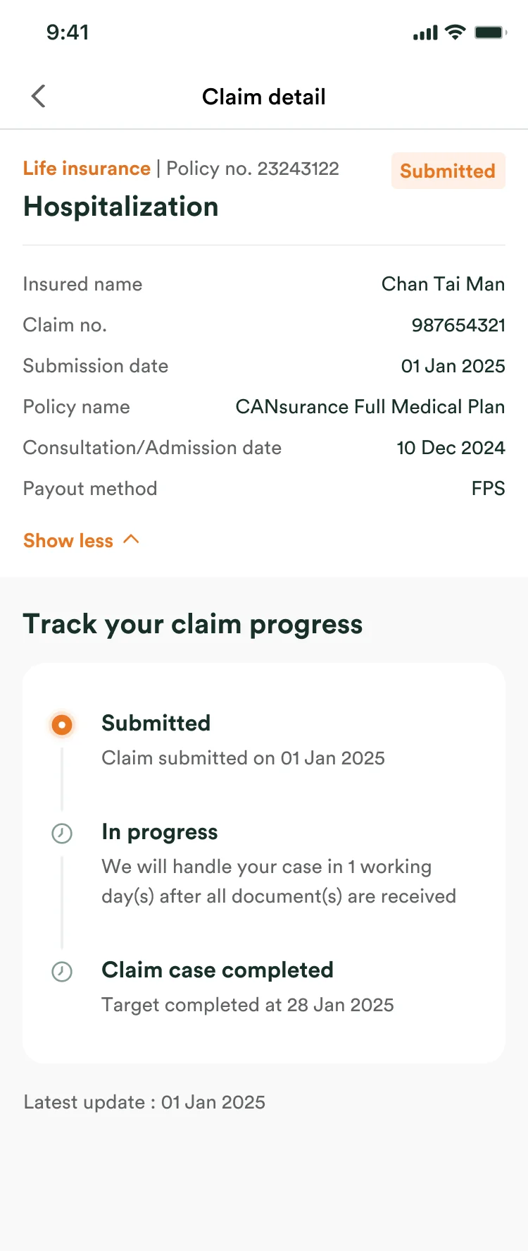
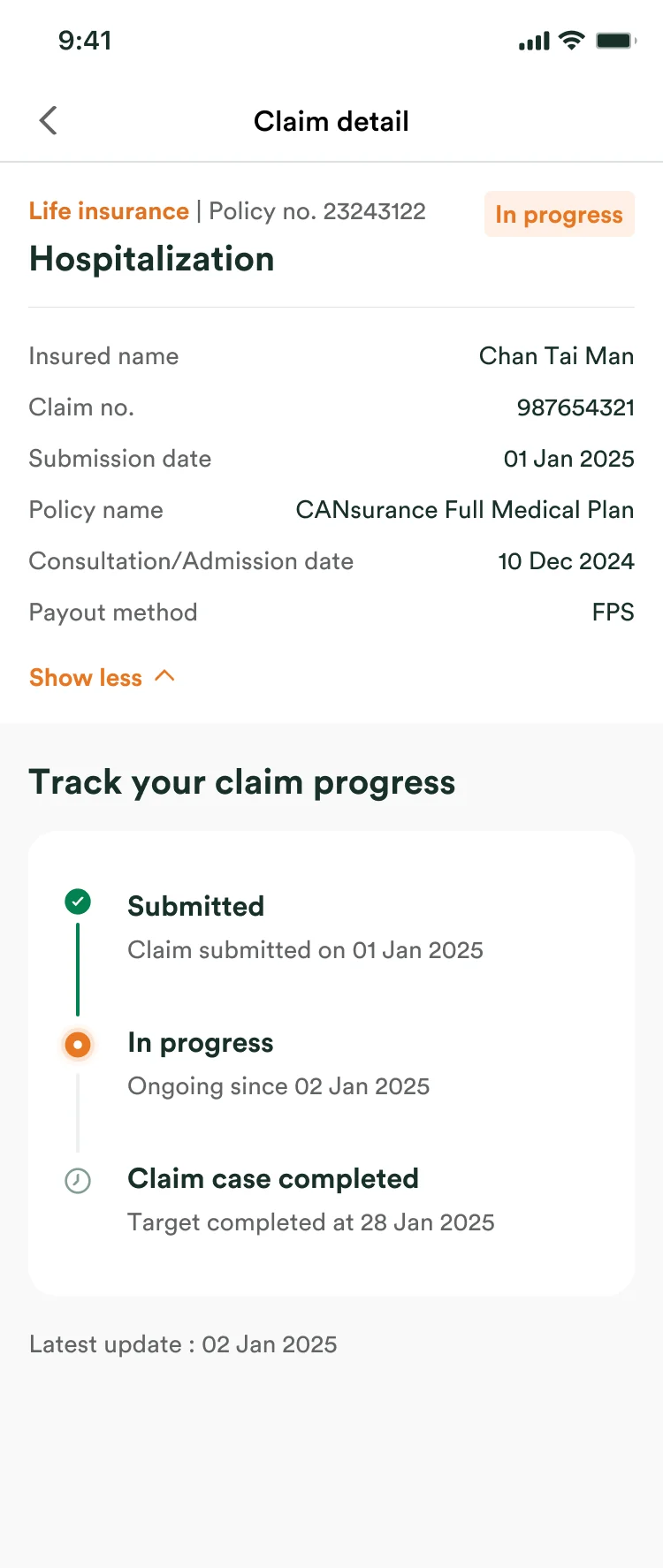
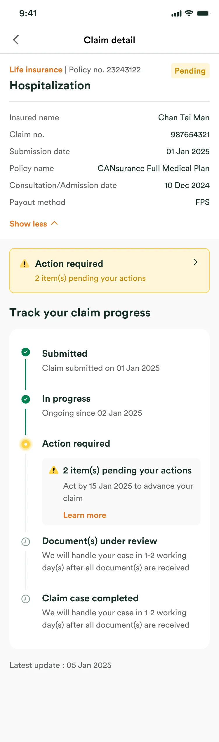
Every claim now says where it stands, what comes next, and by when.
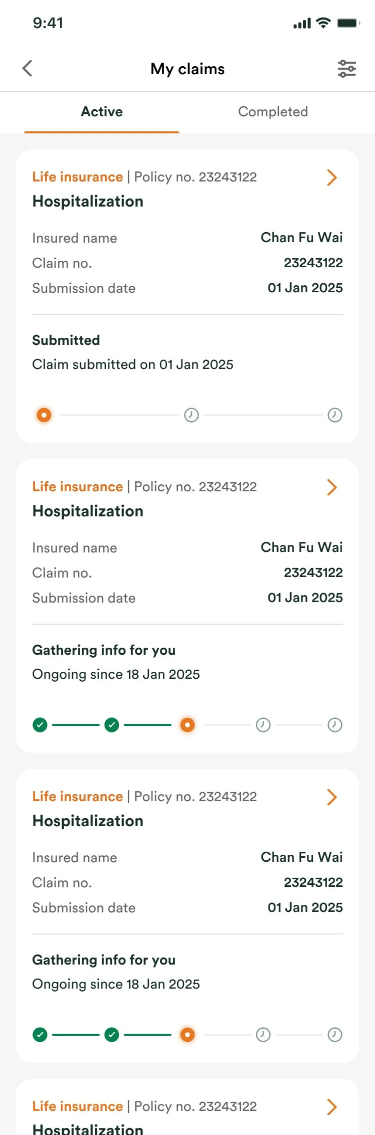
Claim progress you can follow
Every step carries its own status and an expected completion date, so the assessment phase stops being a silent black box.
Telling FWD what happened
The prompt asks for exactly what an assessor needs, in both languages: date, time, place, what happened and which part of the body. A review step and a plain confirmation close the loop, so nobody wonders whether it went through.
Finding one claim among many
Filters are ordered by what people actually use, and because employee benefits and life policies filter on different attributes, choosing the policy comes first instead of showing everyone every option.
Overview
Making a stressful journey easier to follow.
Customers struggled with the app after submitting a claim, and every struggle became a call to customer service. The brief was to find where the journey breaks down and streamline what happens next.
Problem
Submitting a claim dropped it into a black box.
The pain concentrated on one stage
Mapping the journey with the CX, Life Ops and Employee Benefits teams put the damage in one place. Assessment carried nearly all of it, for the customer and the business at once, which is why the work was scoped as a claim tracker rather than a submission fix.
Where that came from
I sat with the CX team and read the feedback they had been collecting, then walked the claim journey end to end with Life Ops and Employee Benefits.
Six complaints, three problems
-
- No proactive updates on admin and transactions
- No clarity on the settlement amount
Opaque progress tracking
No visibility into where a claim stood, so uncertainty turned into a high volume of preventable inquiries to CX.
-
- Unclear which documents are required
- No clarity on which must be original copies
Ambiguous submission process
Unclear instructions on what to hand in produced incomplete submissions (NIGO) that stalled the whole processing workflow.
-
- No timely update when something is pending on them
- Notification lag across SMS, app and email
Disconnected feedback loop
Nothing reached the customer when something needed their action, so the only way to find out was to log in and check again.
Then design audited the screens that carried it
A heuristic evaluation of the two live claim screens turned the complaints into four concrete usability violations.
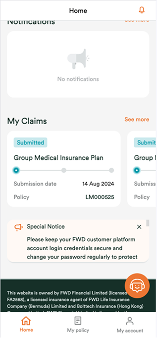
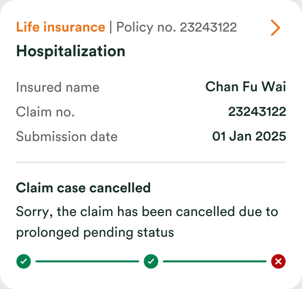
Screen 1: Home
-
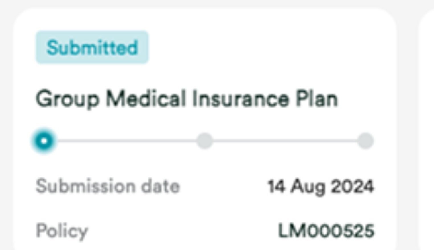 Unclear claim stage
Three bare dots with no labels: the card never says which stage the claim is in, or what happens next.
Visibility of system status
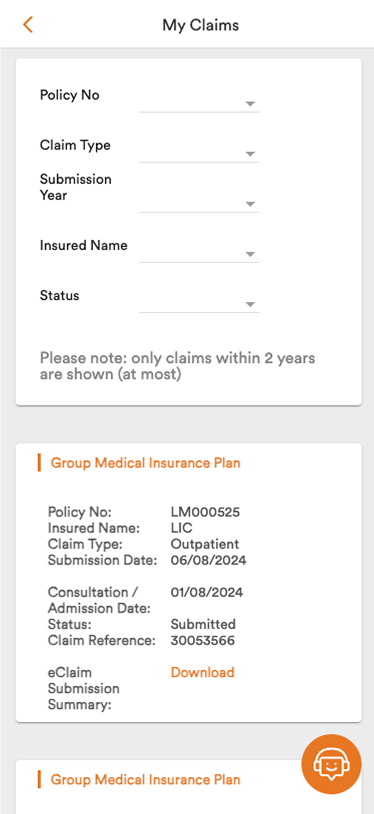
Screen 2: My Claims
-
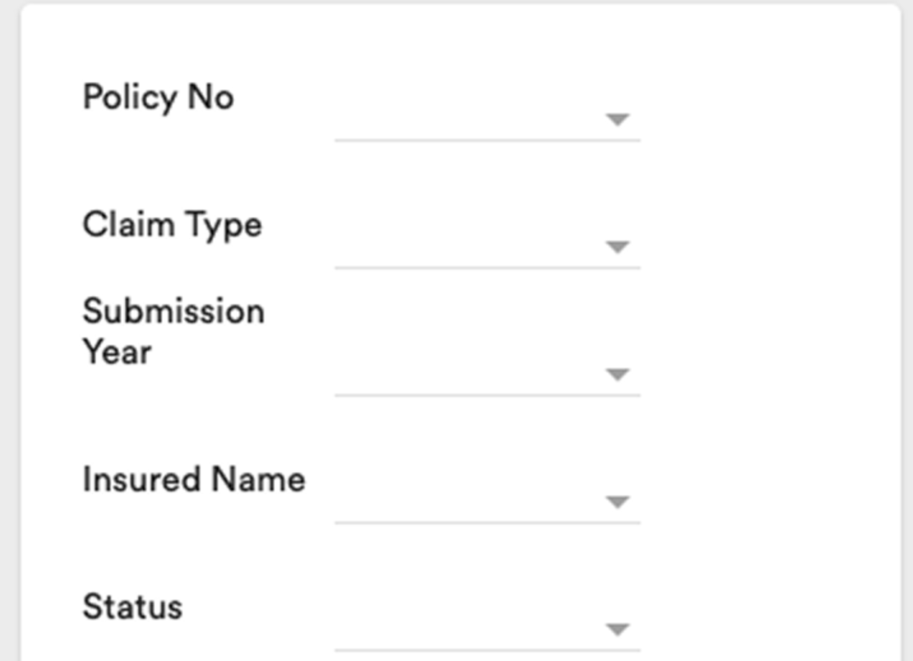 Single-selection filter
Every field takes exactly one value, so common asks like two claim types at once are impossible.
Flexibility & efficiency of use
-
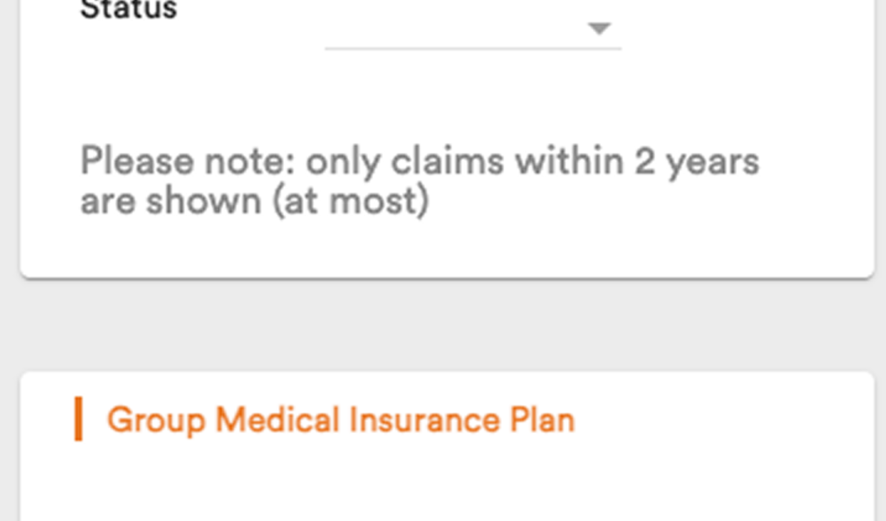 Filter first, claims below the fold
The filter fills the first screen even when it is empty, pushing the claims people came for out of view.
Aesthetic & minimalist design
-
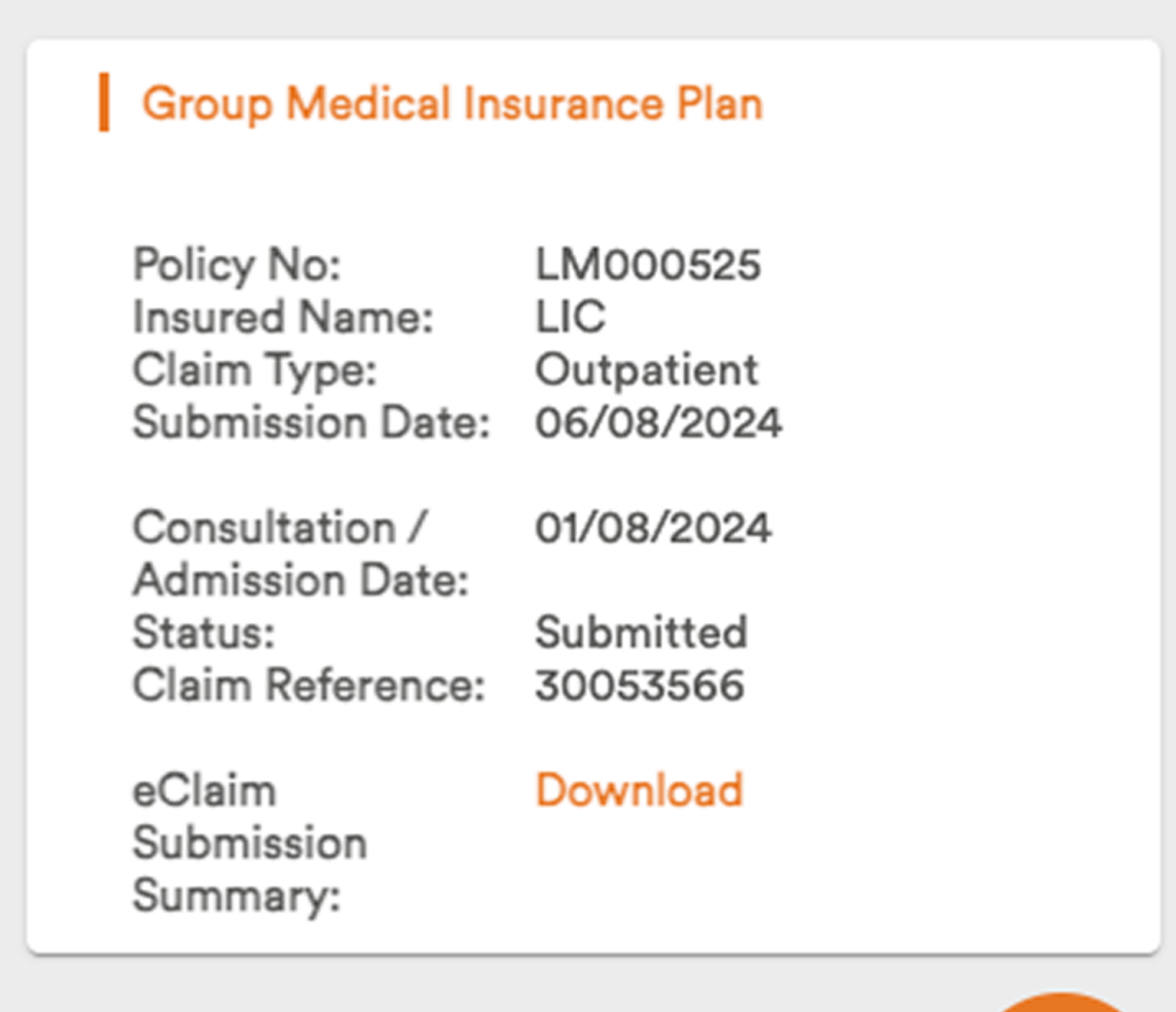 Unclear information architecture
A flat wall of label and value pairs with no hierarchy: people had to read everything to find anything.
Recognition rather than recall
Goals

Design process
Finding the gaps in the current experience, then designing for transparency
Every iteration was checked against one test: at any moment, can a customer tell what is true about their claim?
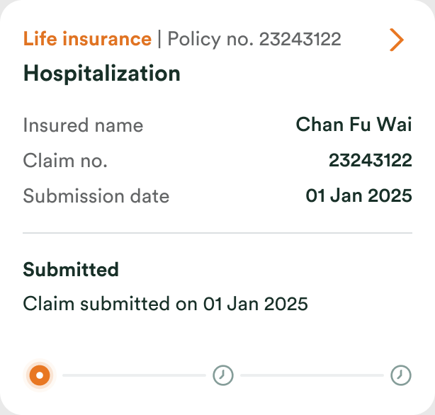
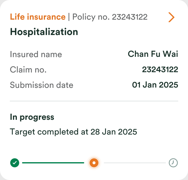
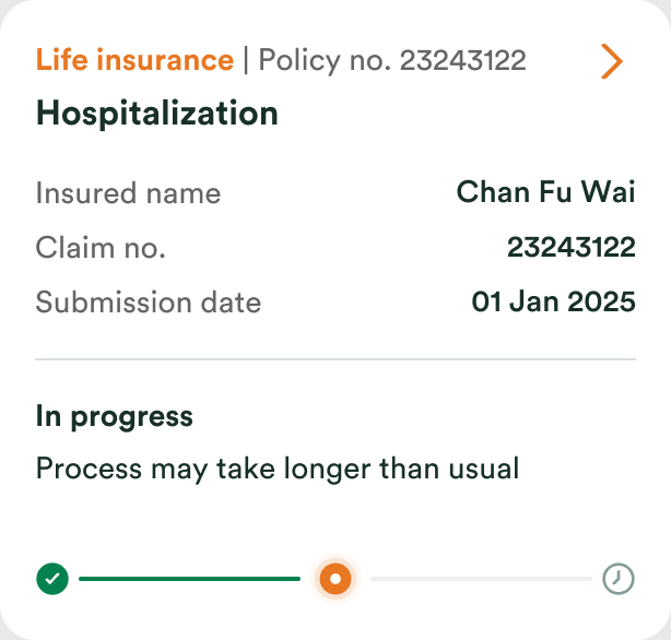
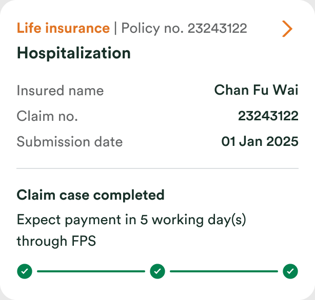
Every state a claim can be in, before any screen.
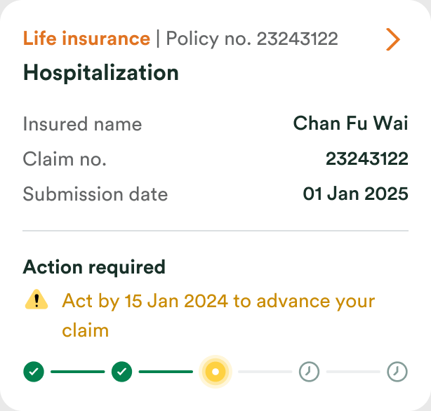
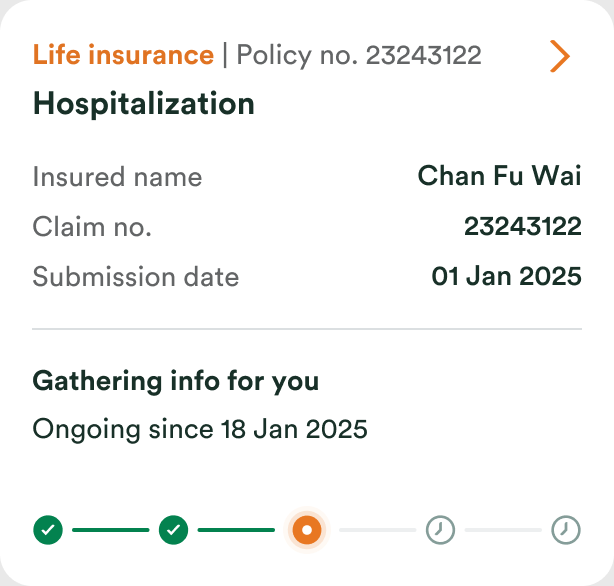
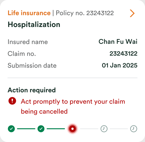
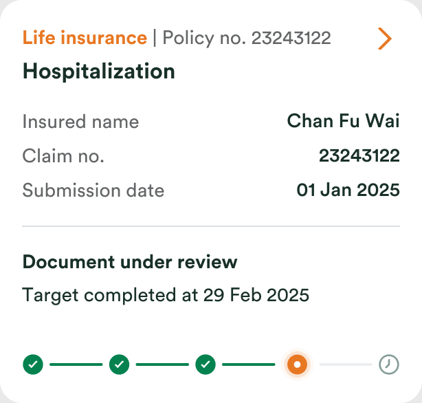
Five tracker states cover the whole system. Three scenarios draw on them for thirteen cards, including the ones nobody enjoys designing.
Happy path
-
Submitted
-
In progress
-
Taking longer
-
Completed
Pending
-
Action required
-
Gathering info
-
About to lapse
-
Document under review
-
Pending case completed
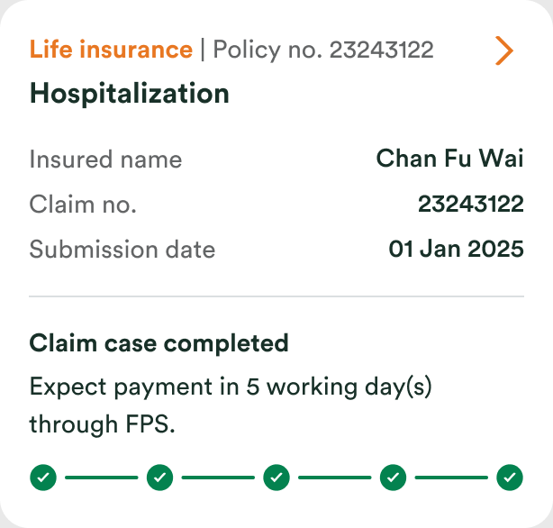
-
Action required
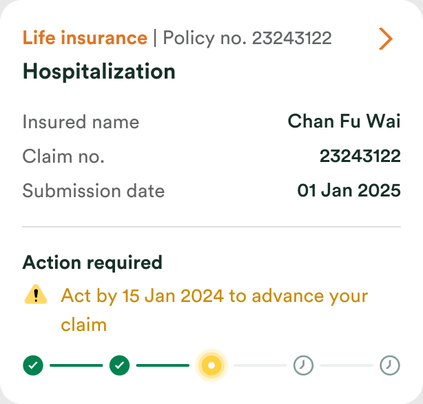
Closed early
-
Withdrawn
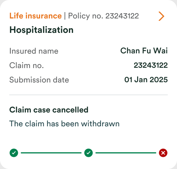
-
Closed
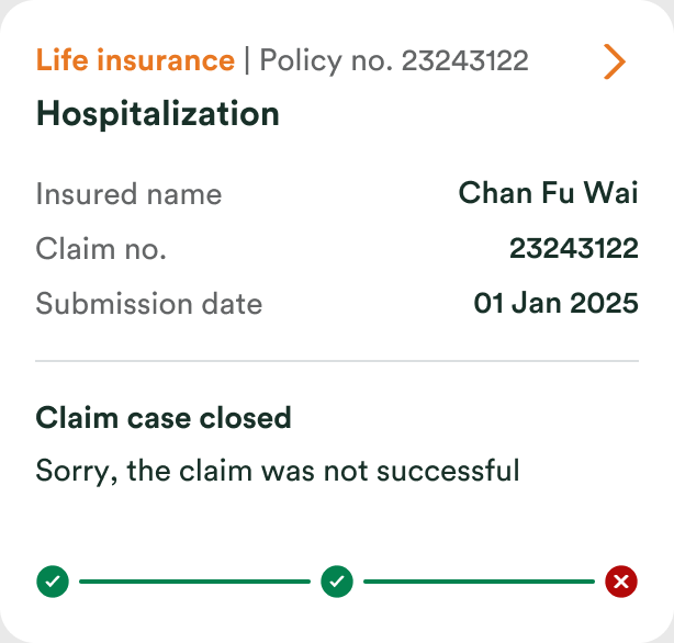
-
Cancelled
The claim leads now, not the filter.
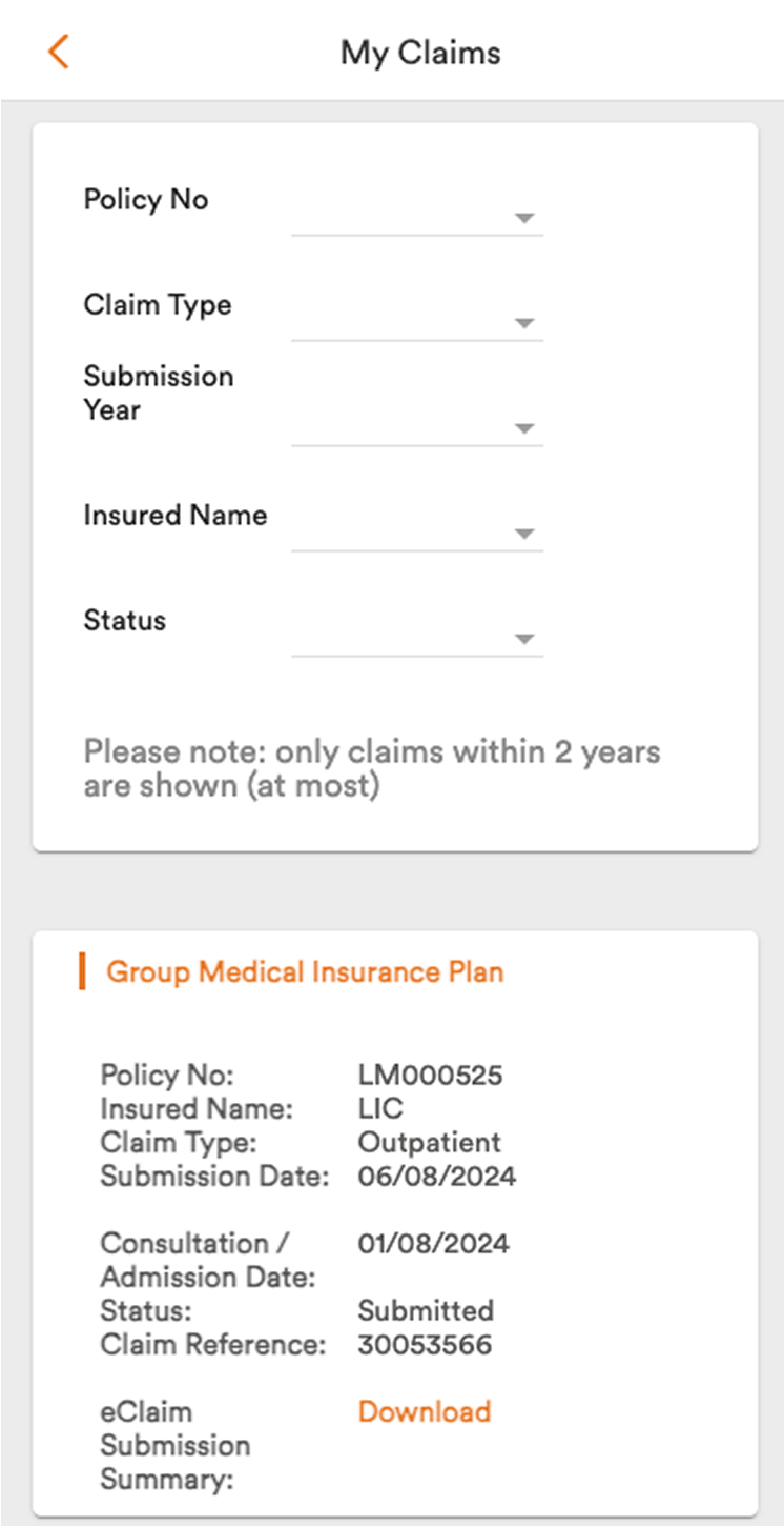 Before
Five empty filters filled the first screen, and the claim arrived as a wall of labels.
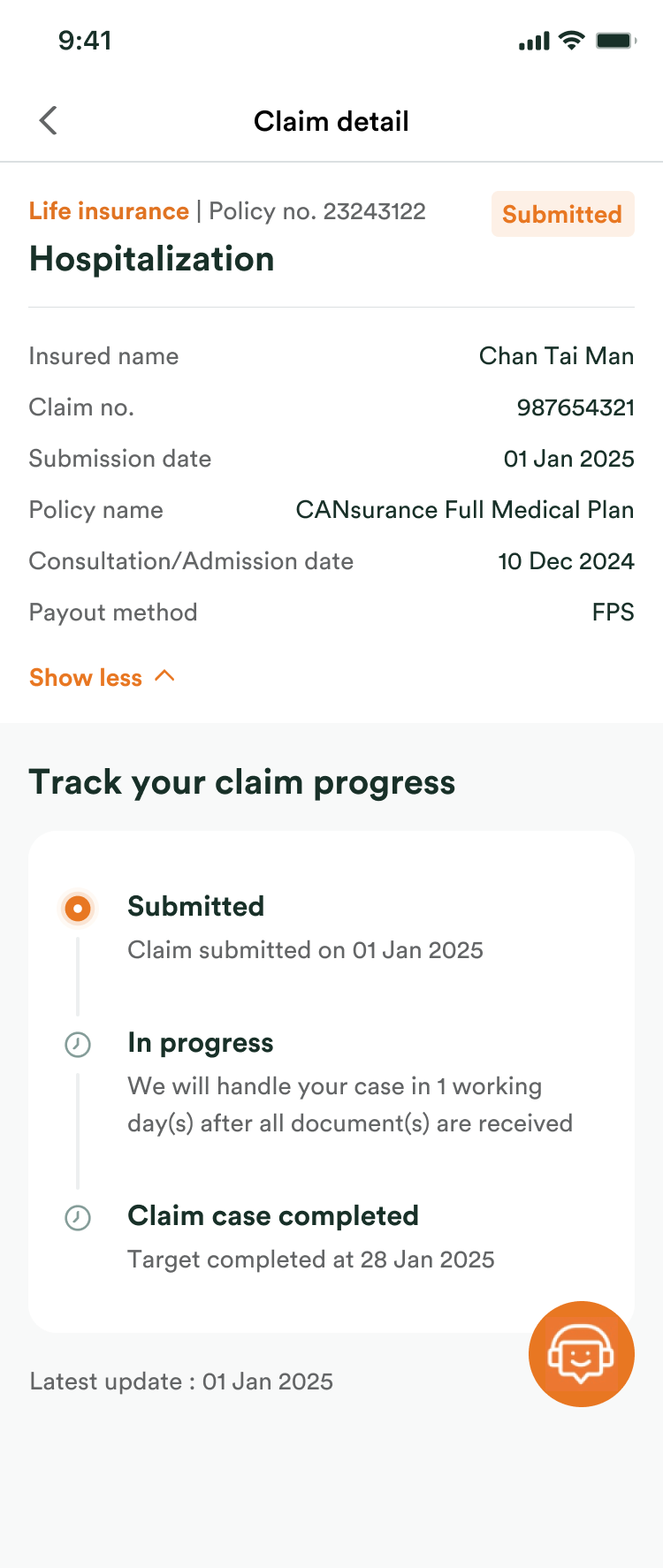 After
The claim comes first, then its progress, with a date at every stage.
A card that says where the claim is.
Before
Three unlabelled dots: no stage, no next step, no date.
After
The stage, and the date it is expected by, on the card itself.
Sending a document became part of the app.
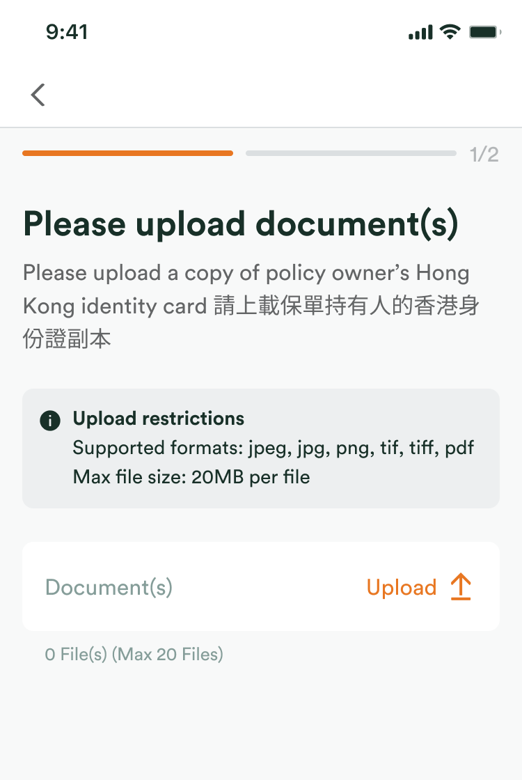
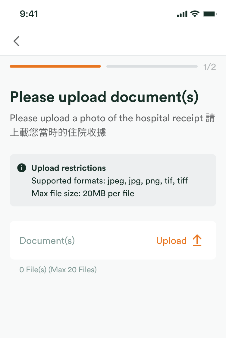
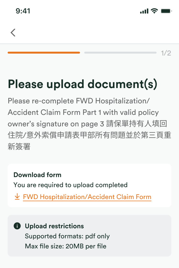
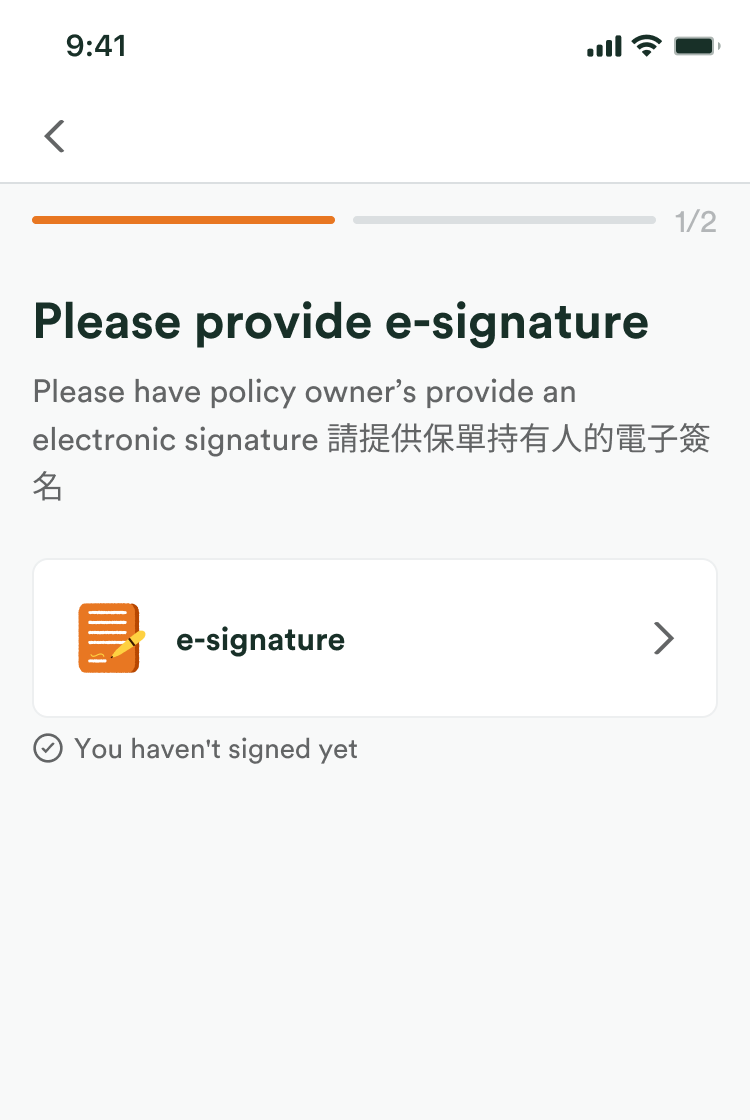
FWD asks for five kinds of thing after a claim is in. Each one gets the same four beats: say exactly what is needed, take it in, let the customer review it, confirm it arrived.
Five kinds of request, one pattern
-
Describe what happened
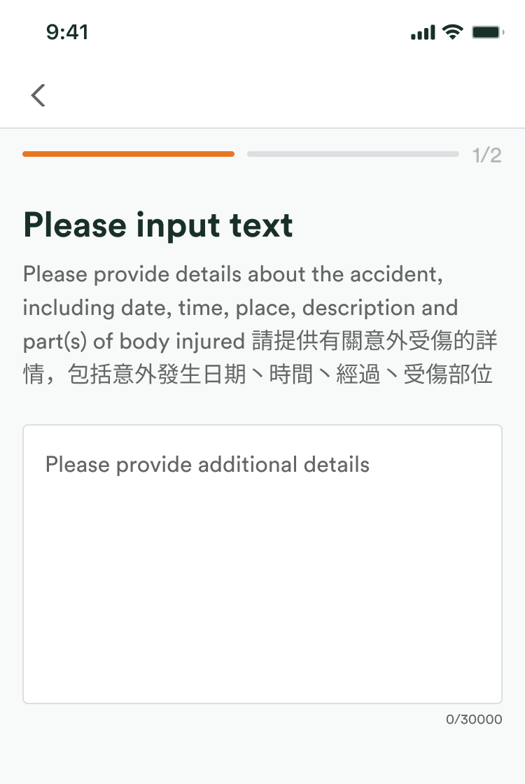
-
Upload a document
-
Upload a photo
-
Fill in an FWD form
-
Sign
-
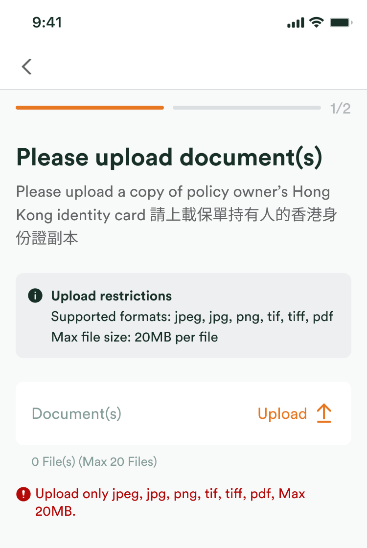
Wrong file type
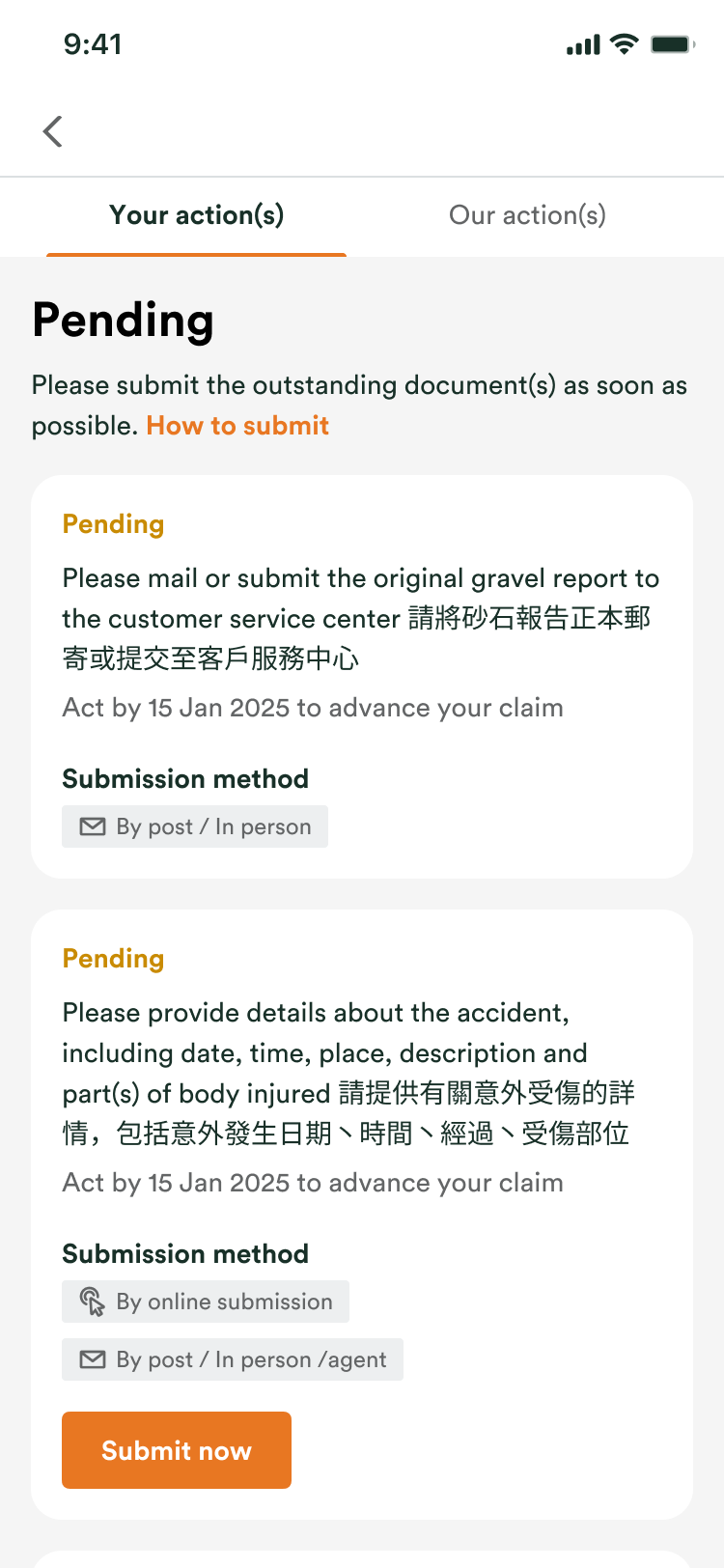
What is outstanding, in one list
Every request waiting on the customer, its due date, and a Submit now on each.
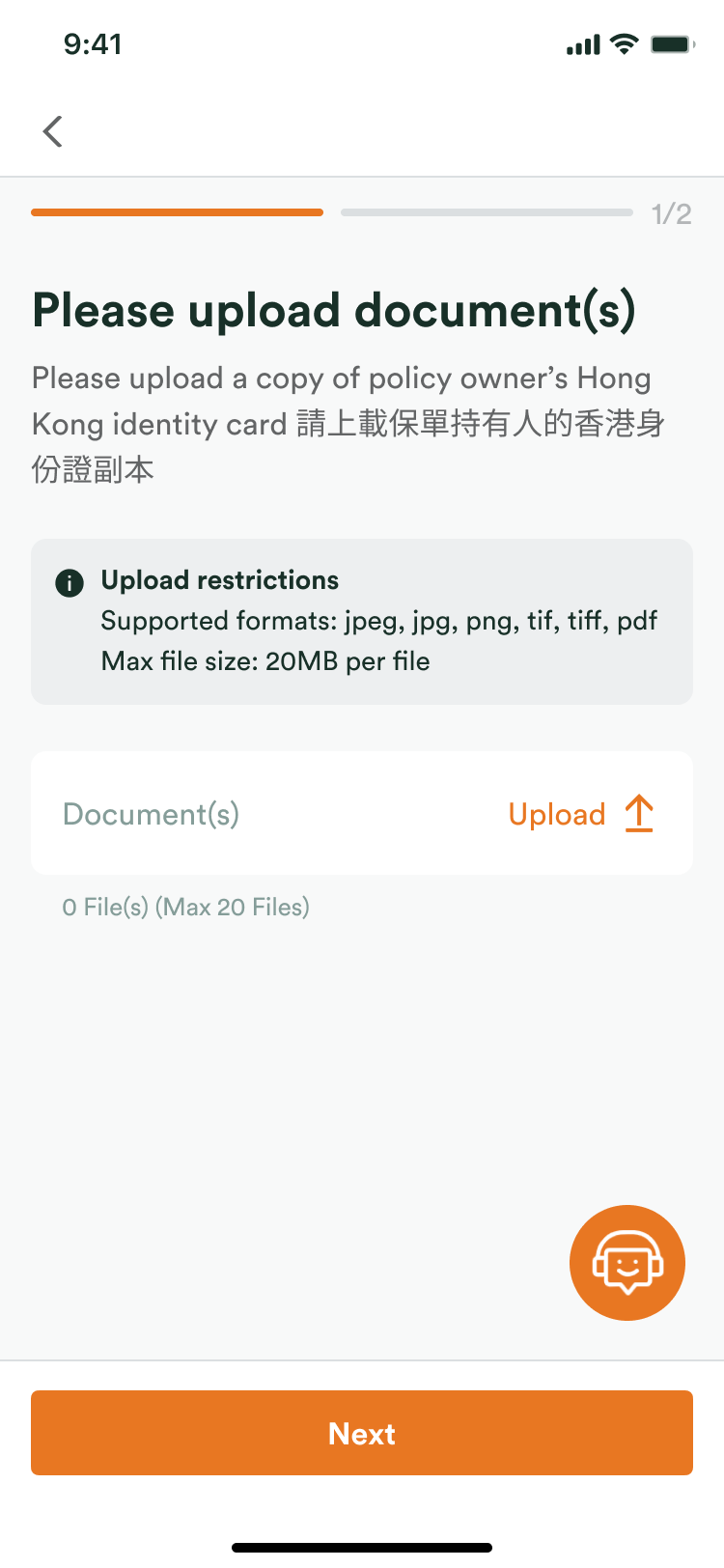
The rules before the file, not after
Accepted formats, size limit and file count sit above the upload, so the first try is the right one.
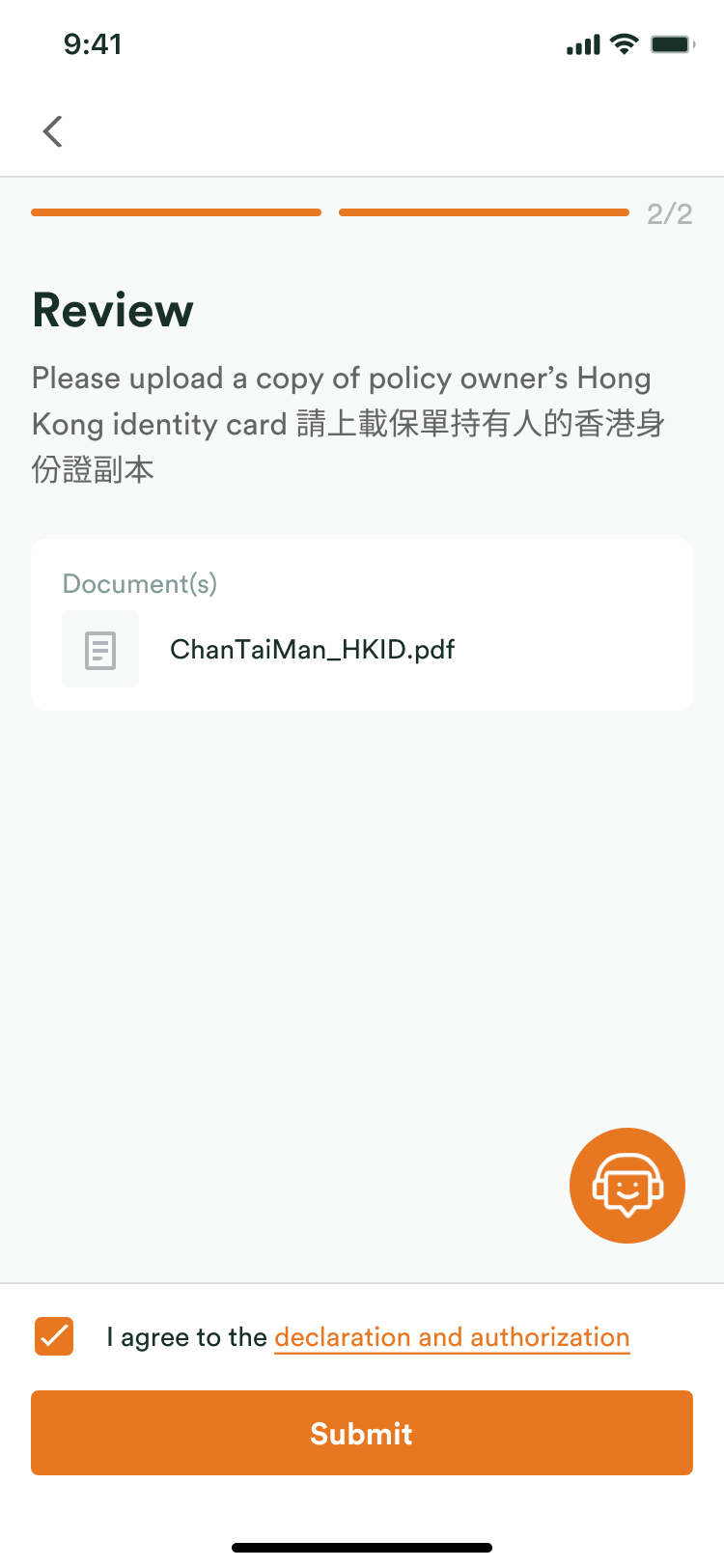
One look before it goes
The file and the declaration to agree to, on one screen.
Then: pre-approved claims.
Before a planned hospital stay or surgery, the customer sends FWD the doctor's treatment plan and cost estimate. FWD answers in writing: what it covers, and what the customer pays. That is pre-approval. The customer is not asking whether they are covered, only what is still needed and when the bill is settled.
Before
Anything FWD needed from the customer was inside a step, found only by reading down the tracker.
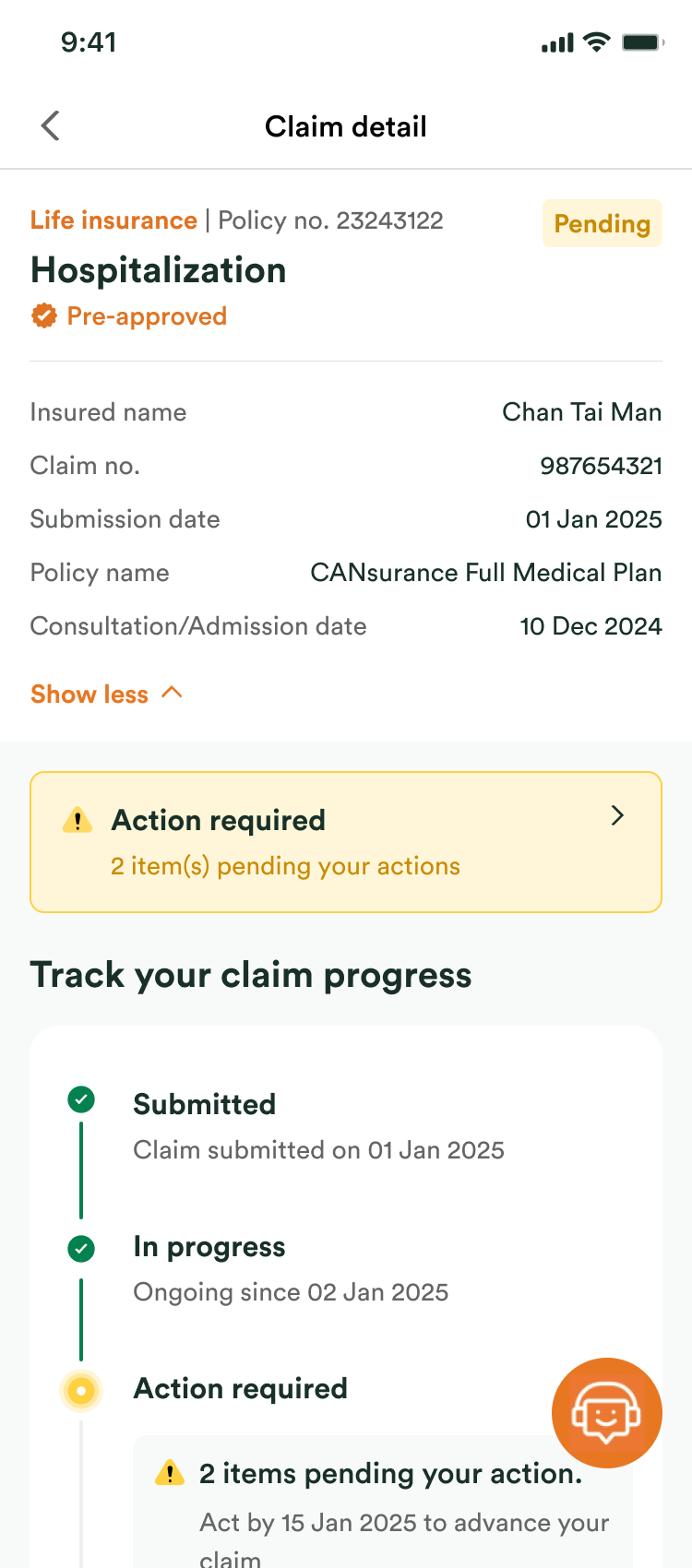 After
A Pre-approved tag, a banner counting what is waiting on the customer, and a step for what FWD collects on their behalf.
Challenges
The backend was slow and the legal wording was fixed, so the design had to work around both.
Legacy backend latency
The backend could not confirm receipt quickly, so a submission sat there looking like it had failed.
Optimistic UI
The screen confirms receipt the moment it is sent, and states an honest expectation for how long assessment takes.
Compliance against clarity
The required legal wording confused people, and it could not be removed or reworded.
Plain language, with the wording one tap away
Plain-language headers carry the meaning; the exact technical wording stays available in a tooltip.
Outcome
Claim transparency improved within a month of launch.
- ↓20%
- Claim-status inquiries to CX
- ↓8%
- Incomplete (NIGO) submissions
- 4.5/5
- Post-claim CSAT